6 Amateur Design Mistakes to Take Your Rooms from Chic to Eek!

Professional vs Amateur Design
Despite the best intentions, small design mistakes may creep into the most beautifully appointed home. These mistakes can be a clear sign that a room was planned by an amateur, adding a general feeling of uneasiness perhaps not easily pinpointed. To safeguard your home against these design mistakes, follow our lead and avoid these common design slips. Trust us, your guests will thank you for your thoughtful, tasteful decoration.
1. Using the Wrong Size Rug
A correctly sized rug can add sophistication to any room. An incorrectly sized rug makes a room’s scale feel out of proportion and has a tendency to cheapen the entire design scheme, regardless of how much money has been invested in the rest of the space. A rug should be anchored by the furniture feet in the central seating or walking area – or at least by the front feet of each piece. If you are torn between two options, size up.
If a rug is too small for a space, but you still want to use it, you can layer it on top of a larger, neutral rug, like a sisal or jute rug.
2. Most Accent Walls
Accent walls come in and out of fashion, like bold and minimal design schemes. Accent walls may make a room feel dated if not carefully considered. The way to avoid this is to avoid accenting any one particular wall altogether. Show confidence in your design scheme, commit to that bold color or pattern, and use neutral accents and lighting options to tone done or draw attention to various points of interest in the room.
3. Keeping Generic Light Fixtures
We’ve all been guilty of ignoring the effect lighting has on our design scheme. Especially in new construction or newly renovated homes, generic lighting – like standard recessed pot lights or that ONE kitchen light fixture that’s sold at every home improvement store and makes its way into every basic remodel.
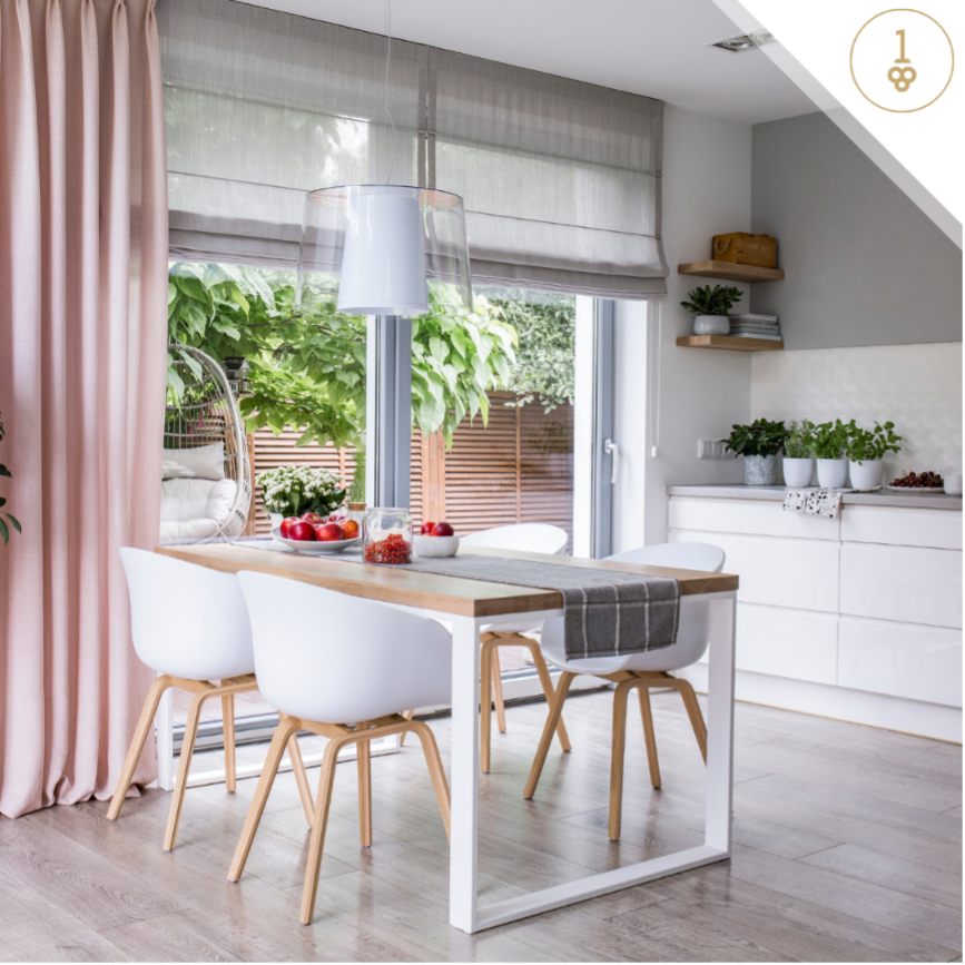
Consider lighting the jewelry of your home and select fixtures that instantly elevate and add elegance and emotion to the space. A carefully curated lighting plan should include lighting for all potential uses in the room – a large chandelier or ceiling fixture, various sconces, art lights, floor lamps, table lamps, pendants, flush mount lighting, and backlighting. Layering lighting creates a collected space and invites visitors to stay awhile. Thoughtfully chosen lighting can also give a room various personalities if it has shared functions.

4. Relying on Mass-Produced Art
Regardless of price point, commercial art lacks the bespoke touch that art can bring to a space. Custom art elevates a space and is often the finishing touch to make a room feel unique and to give personality. Custom pieces offer depth and individuality that art from retailers often lacks – as this art is designed to appeal to the masses. If hiring an artist is not an option for monetary restrictions, scope out art at yard sales and local fairs. Often, the most unique sculptures, paintings and décor are those given new life after being loved by someone else.
5. Hanging Art too Low or too High
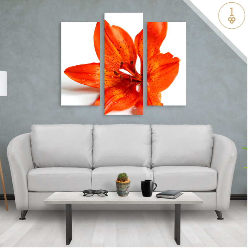
Even with custom art, a whole room can feel uncomfortable if the art is hanging at the wrong height. A general rule of thumb is that the middle of the art should be between 57 and 60 inches off the ground, somewhere around eye level. Art above the sofa should range two-thirds of the sofa’s width and be approximately six to eight inches above the sofa. When working with multiple art pieces in an array, consider the outline of the grouping and the spacing and staggering between pieces. Use removable tape to mark the outlines of all frames and make sure to stand back and use the entire wall as a frame of reference.
6. Hanging Curtain Rods too Low
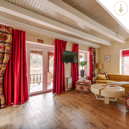
A simple trick that many professional designers know is that curtain rods can hang much higher and much wider than the windows themselves. If the curtains and curtain rod frame the window precisely, they can make the room feel small and cramped. Extending the curtain rod eight to 12 inches on either side of the window and eight to 12 inches above the window frame can turn standard windows into stunning focal points. Don’t have that much room between the top of the window and the ceiling? Hang the rod at the exact midpoint. When in doubt, aim higher and wider with your curtain frame.
Design Like a Pro
As you design or redesign your home, making these small corrections over time will add up to a big difference. Resist the design blunders that can make a luxury home feel less than luxurious. Tweak the design to take your rooms from eek to chic!

Related Post: Home Remodeling Projects Best Left to the Professionals


